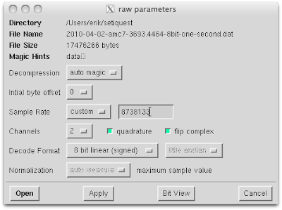
The following command line was used to stream the Exoplanet 060 data files into baudline:
cat 2010-03-19-exo060-8bit-* | baudline -session setiquest -stdin -format s8 -channels 2 -quadrature -flipcomplex -samplerate 8738133.33 -fftsize 65536 -pause -utc 0
Full 8.738 MHz view
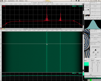
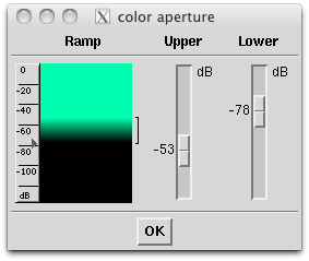
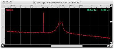
The Exoplanet 060 files were streamed into baudline's standard input. A 65536 point FFT was used for a bin resolution of 266.667 Hz/bin. Optimal anti-alias beam slices were used to smooth the spectrogram and the Color Aperture window was tweaked to maximize the color resolution.

The shape of the Average spectrum is slightly lumpy with a mild counterclockwise skew. The previous setiQuest data sets have been mostly flat. The lumpiness and spectral skew is most likely caused by a combination of the beam steering and the off axis response of the telescope.
Here is a list of the potentially interesting targets:
- -1681 kHz (hump) lower
- -403 kHz (multiple tones)
- -235 kHz (Hydrogen)
- +1222 kHz (hump) upper

Zero Gaps
There is a gap of 0.057 seconds at time 03:36 from the start of the first data file. This would place it 216 seconds into the -1-of-10.dat file. The gap consists of the sample value zero. Here is a spectrogram of the gap:

Here is the Waveform window at timebase=2048X zoom showing the gap:

The beginning of the gap is visible in this Waveform window at timebase=1X zoom:

It looks like the zero gaps start and stop abruptly and they occur numerous times throughout the 19 minute data file.
List of zero gaps (minutes:seconds.milliseconds, gap duration seconds):
- 00:25.831 - gap = 0.032s
- 03:36.177 - gap = 0.057s
- 06:50.280 - gap = 0.703s
- 06:59.938 - gap = 0.077s
- 08:00.069 - gap = 0.227s
- 10:55.104 - gap = 0.326s
- 11:16.411 - gap = 0.102s
- 12:16.167 - gap = 0.073s
- 12:31.115 - gap = 0.183s
- 15:00.467 - gap = 0.073s
- 16:00.130 - gap = 0.048s
- 16:30.969 - gap = 0.203s
- 18:25.823 - gap = 0.176s
Power Fluctuation
Five different Average spectrum traces from different locations in the 20 GB data file are shown below:
 This represents a power fluctuation of about +1 dB. A possible source of this fluctuation could be due to the Earth's rotation changing the angle of dish collection which changes the gain. Not sure if the ATA was physically or electronically steering the dishes.
Data was collected for the entire file using the full dB power measurement along with the -debugmeasure flag to capture the numeric data for external plotting. Below is a dB vs. time graph that shows how the power fluctuates:
 This plot shows a min-max delta of 0.9 dB along with 8 zero gaps. This fluctuation won't cause a problem for shorter integrations but for longer integrations the stronger sections will swamp out the weaker areas. A potential solution would be to normalize the gain with an AGC but that sort of correction will introduce other artifacts. It is best to leave the data the way it is and try to systematically avoid the problem.
Hydrogen has Sidebands
Hydrogen is the largest peak in the center (-235 kHz) of the Average display below:

The two small humps at -1750 and +1250 kHz are both exactly 1455 kHz away from the hydrogen peak. Another way of saying this is that the hydrogen peak is exactly in the middle of the two small humps. It appears that hydrogen has sidebands. I've never seen hydrogen have sidebands before, so this is new. There are a couple ways sidebands could of been created.
Modulating the hydrogen peak with AM modulation at a frequency of 1455 kHz would create similar sidebands. Something modulating interstellar hydrogen seems crazy. What force could do something this cosmic? Gravitational waves or Dark Matter?
Signal distortions can also generate sidebands. Artifacts introduced by the ATA data collection or signal processing equipment could be the source. It is difficult to know for sure without having access to the hardware and being able to run tests. An interesting clue is the sample rate of 8.738 Msamples/second divided by the sideband delta of 1.455 MHz equals 6.0055 which is close enough to the whole number six to be suspicious. ADC caused signal artifacts are often related by whole number multiples to the signal under test. The ATA's ADC is sampling at 100 * 2^20 samples/sec and being decimated by 12 so that 6 is starting to look more suspicious.
Hydrogen and Friends
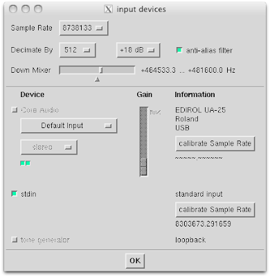
The Input Devices window was set to decimate by 8 and down mix into the -786 ... +307 kHz region. A +12 dB gain was used to maximize the available sample bits.

The Average spectrum below shows hydrogen and bunch of strong tones to the left that look like distortion products.

Like in the Kepler Exo4 blog post, the close proximity of the multiple tones to hydrogen is interesting.
-403 kHz (multiple tones)
Decimation by 32 and down mixing to the frequency of the multiple tones for a 8.333 Hz/bin resolution. The Average window shows three spectral traces from different parts of the data file. The spectrogram display shows the entire 19 minutes of data. Notice that the power fluctuations and gaps are visible. Constant and pulsing tones are also scattered across the spectrum. The spacing of the tones look like distortion products.

Grouping the targets into cyan, magenta, and yellow (CMY) color groups in the Average window:
 The cyan, magenta, and yellow color groups look like carriers with lower and upper sidebands. The delta frequency between the carrier and the sidebands is 25600 Hz for all of the color groups. This suggests that the groups are related. AM modulating each of the carriers with a 256oo Hz sine wave is one way to create such a harmonic structure.
 The exact measured value is 25600.024 Hz using the delta Hz measurement window. A little bit of math: ADC sample rate 100 * 2^20 / 25600 Hz = 4096. This suspicious power of 2 number suggests that these are distortion sidebands that are related to the ADC or its follow on processing. Distortion harmonics with a 25600 Hz delta were also seen in the AMC-07 data.
Here are the color groups and their center frequencies:
- Cyan -499733.3 Hz
- Magenta -416316.1 Hz
- Yellow -401945.2 Hz
Cyan -499733.3 Hz
Setting the decimation to 4096 results in a 0.0651 Hz/bin resolution. Decimation gain was set to +36 dB gain so as to maximize SNR. Moving the down mixer to look at the tone at -499733.3 Hz shows a non-drifting pulsing signal. A spectrogram of the entire 19 minutes is below:
 The lower and upper sidebands are about 0.54 dB down and they look identical to the carrier. This means that they are not mirror symmetric so they are not true lower and upper sidebands.
Magenta -416316.1 Hz
Decimating by 4096 again while down mixing into the -416316.1 Hz tone shows a drifting random walk signal:

The tone starts at -416316.1 Hz and ends at -416316.1 Hz. A random walk with a drift of +8.66 Hz / 1135 seconds = +0.00763 Hz/sec. The lower and upper sidebands are about 0.7 dB down and they look identical to the carrier.
Yellow -401945.2 Hz
Decimating by 4096 yet again while down mixing into the -401945.2 Hz tone shows a drifting random walk signal:
 This drifting random walks looks different than the Magenta group and it has no features in common. The tone starts at -401945.2 Hz and ends at -401935.0 Hz. A random walk with a drift of +9.8 Hz / 1135 seconds = +0.00863 Hz/sec. The maximum deviation was almost +12 Hz/sec before it wandered back to +9.8 Hz/sec where the file ended.
The lower and upper sidebands are about 1.1 dB down and they look identical to the carrier.
Digging in the NoiseLooking deeper into the noise ... searching, decimating, integrating, drifting ... finding some very weak signals. Here is an annotated spectral map that shows what signals are going to be investigated and which section of spectrum is going to be zoomed:


The magenta and yellow dots are references for the previous carriers. The yellow F3, orange, and red dots will be analyzed from left to right below. The following spectrograms used a decimation by 4096 for a 0.0651 Hz/bin resolution and the Auto Drift algorithm for additional spectrogram extraction ability (about an extra dB in this case).
-478744 HzDrift rate of +9.37 Hz / 1135 seconds = +0.00826 Hz/sec. This drifting-random-walk signal looks like a weaker version of Yellow -401945.2 Hz. What is interesting is how far it is away from the Yellow carrier. Some math: -478744 Hz - -401945.2 Hz = -76798.8 Hz / 25600 Hz = -2.999953 which is practically 3. So this signal is the -F3 harmonic of the F0 yellow carrier. The +F3 harmonic is at -325146 Hz and its spectrogram looks identical.

-422933.3 HzVertical pulsing signal directly in the middle of the spectrogram. Drift rate is 0.0 Hz/sec. This signal is extremely interesting and it will be demodulated in the Advanced Analysis section below.

-415089 Hz
Orange. Interesting cyclic random walk signal. The spectrogram of the carrier harmonics at plus and minus 25600 Hz look identical but weaker. Drift rate of +11.78 Hz / 1135 seconds = +0.01038 Hz/sec.

-409252 HzAn extremely weak random walking signal that has about twice the frequency swing of the previous cyclic signal. This signal is pushing the limits of what can be visually detected in the current version of the baudline software. Drift rate of +7.16 Hz / 1135 seconds = +0.00631 Hz/sec.

-407416 HzA random walk that disappears just before the 700 second position which equates to the 438 seconds from the start of the data. There are several zero gaps and a large power fluctuation discontinuity at this position. The signal disappears into the noise as the total system power continues to decrease. The signal becomes visible again near the end as the system power increases. This an excellent example of the signal detection problem created by the fluctuating power.
Drift rate of +12.63 Hz / 1135 seconds = +0.01113 Hz/sec.

-406250 HzDrifting random walk with a drift rate of -0.98 Hz / 1135 seconds = -0.00086 Hz/sec. This signal is interesting because it is the first negative drift rate.

-400943 HzVery wide sweep, had to change spectrogram zoom to Hz=2X. Delta drift of -16.2 Hz / 1135 seconds = -0.0143 Hz/sec but the initial swing was almost -50 Hz. The shape of this signal looks a lot like the curve in the Power Fluctuation plot but with time reversed. There is no logical reasoning for this similarity but it is an oddity worth pointing out.

Exercise for the reader: For the orange -415089 Hz signal and the -400943 Hz signal above, assume the basic curve shape was caused by Doppler drift applied to a narrowband signal. Describe the motion that would cause this drift. For bonus points calculate the required velocities. Feel free to discuss this in the comments below.
Advanced AnalysisWhat other hidden signal characteristics are lurking in this Exoplanet 060 data file? We will answer that question in this section by demonstrating how some of baudline's more sophisticated tools work. Autocorrelation, cross-correlation, demodulation, blip Fourier phase, quadrature magnitude, transfer function, impulse responses, and Auto Drift will all be explored.
DemodulationIn this section we will attempt to demodulate the cyan -499733.3 Hz signal that was discussed above. This non-drifting signal signal is most likely of terrestrial origin but nevertheless it has some very interesting structure. We have re-downmixed the -499733.3 Hz signal and decimated it by a total factor of 1048576 for a 0.01526 Hz/bin resolution. Below is the Fourier spectrogram:

Even at this additional magnification the signal appears to have zero drift. A pulsing pattern is visible but there appears that there might be something more going on with the signal. Let us zoom in a little for more a closer look. We will be decimating by 4194304 for a 0.00381 Hz/bin resolution.
Click this Average display image for a larger version:

This looks a lot like a strange sort of Multiple Frequency Shift Key (MFSK) with an extra tone off to the side. Here are the frequencies of the 4 tones { 2000.0114, 2000.0691, 2000.1068, 2000.1605 } Hz. Calculating the deltas between the frequencies {0.0577, 0.0377, 0.0537 } Hz which appears very non-uniform. Grouping similar looking peaks; the delta between the first and third is 0.0954 Hz while the delta between the second and forth peaks is 0.0914 Hz. The forth off-to-the-side tone has a unique distinction of being -4 dB down from the others and spectrally isolated.
Due to the extreme nature of the magnification we will be using the blip Fourier transform to improve the visual resolution for the next two spectrograms. Here is the blip magnitude spectrogram:

The multiple frequencies toggling on and off create shapes that seem to have some structure. Using baudline's periodicity bars reveals a baud rate that varies between 18 - 24 seconds (0.056 - 0.042 baud). The symbol spacing appears periodic but its non-constant rate is troubling.
For a change of perspective let's rotate the modulated structure counterclockwise 90 degrees:

Next, let us see if looking at phase space tells us anything more. Here is the blip phase spectrogram:
 Several abrupt phase changes are visible. They appear during some of the longer duration symbol patterns which suggest some form of mixed frequency and phase coding like Orthogonal frequency-division multiplexing (OFDM). This is very different than the phase changes of the drifting-random-walk FSK signal observed in the Kepler Exo4 analysis.
Next let us try looking at this strangely modulated signal with the Autocorrelation transform. Think of the horizontal spectrogram slices as time-domain waveform plots that have been automatically time slip corrected for the variable baud rate. The pulses (beats) represent individual symbols and the patterns created are how the symbol relationship change over time.
Autocorrelation with a square window shows the relative global viewpoint:

Autocorrelation with a Kaiser window beta=40. shows the relative local viewpoint:

The two Autocorrelations show that both the global and local structures have complicated symbol relationships. Demodulation could use these Autocorrelation plots to help determine exact symbol transition (baud) points.
More demodulation TBD.
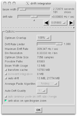
Auto DriftA Doppler drifting signal spreads out its energy across the spectrum as it moves. This makes detection of drifting signals much more difficult. Auto drift is an algorithm that searches all of the possible linear drifting paths for the correct solution. It works in the Spectrogram and Average displays. It operates in both of baudline's Record and Pause modes. It has multiple controls, adjustable parameters, and algorithms. It is very CPU and memory intensive. It is also extremely powerful at pulling weak drifting signals out of the noise.
Below are two screenshots of the Average display. The first is the plain Fourier transform of a familiar chunk of spectrum. The second is the Fourier (green) overlayed with the Auto Drift (purple) spectrum.


Notice how Auto Drift increased the strength of the two biggest peaks by 2+ dB. Another interesting observation is that the Auto Drift's noise floor increased while it's variance was reduced. All of the linear drifting signals got a boost equal to or greater than the increase in the noise floor while the amplitude of the stationary signals did not. This spectral display could be used to quickly determine which signals are drifting. The two purple dots represent weak signals that the Auto Drift algorithm discovered. Let's zoom in and get a closer look:

The two purple dot signals at -410768 Hz and -409577 Hz were not there before. To further explore the two purple dots we will be zooming into the frequency domain by decimating by 4096 and using the Auto Drift algorithm in the spectrogram display for a little more signal extraction. Let us look at the first -410768 Hz signal:

The frequency zoom was increased to Hz=4X so that the quickly drifting signal would fit on the spectrogram display. This signal has a slight random walk with a drift of +68.5 Hz / 1135 seconds = +0.0604 Hz/sec. This is much faster than we've seen in the previous sections.
 We can use the auto drift rate measurement window to query the Auto Drift solutions on a peak-by-peak basis. To do this you'll need to set the source to Average and the fundamental rule to one of the mousing modes. Next you just move the mouse over the peaks in the Average display to get that particular Hz/s drift rate. Note that this also works with the spectrogram/spectrum while recording. Auto Drift quality control can have an effect on the resolution granularity. It is interesting the Auto Drift solution used a +0.0552 Hz/sec drift rate while above we measured a +0.0604 Hz/sec drift rate by hand. The reason for this disparity isn't human measurement error or algorithm quality granularity. What Auto Drift did is calculate a solution using a different path, a more optimal path. Look at the spectrogram with a straight edge, compare the two paths, and you'll see that the algorithm was correct.
Next let us look at the -409577 Hz signal:

The auto drift rate measurement says that the peak beneath the purple dot is drifting at -0.0191 Hz/sec. Note that the stronger signal to the right is -209252 Hz that was investigated above in the Digging in the Noise section. The spectrogram below has been zoomed into the frequency range represented by the purple dot centered at -409577 Hz.

Do you see the signal? I don't but I do see several clumps of brighter than usual blips. According to Auto Drift the linear path solution has a drift rate of -0.0191 Hz/sec which starts at -409555 Hz and ends at -409577 Hz. The signal path is not obvious in this view so let us look at a Hz zoomed in version of the Average display:

The Auto Drift solution has been spread out. The seven purple dots have drift rates of { -0.0304, -0.0291, -0.0278, -0.0255, -0.0274, -0.0219, -0.0191 } Hz/sec. Notice that the drift rates are slowly decreasing from left to right. The normal fluctuation of drift rates is random in the positive and negative directions. The seven purple dots are clearly related and suggest the actual drift had a curved non-linear shape.
Next let us take a look at the inner workings of Auto Drift. Behind the scenes so-to-speak. Beams slices were set to 218 seconds and the auto drift quality was set to 6. Baudline dynamically allocated a 1.3 gigabyte buffer to calculate this spectrogram:
 Click the image above for a higher resolution version and see the fine structure detail. That spectrogram image is made up of 10.2 billion drift vectors. The black region at the top is working space because of the large beam slices used and should be ignored. The spectrogram intensity begins to fade about half way down and then gets stronger near the end. This tracks the Power Fluctuation plot perfectly and it causes numerous integrating problems due to mismatch in spectral levels as a function of time. Auto Drift performance would of been better with a constant power envelope. The main feature of interest in this spectrogram plot is the detailed structure created by all of the drift vectors.
Drift vectors are going every which direction but there is a prominence of drift vectors traveling from right to left in the middle frequency section of the spectrogram. This corresponds to what we saw for the Auto Drift plot when we zoomed in the Average display. That is, a clumping of vector solutions with a general -0.02 to -0.03 Hz/sec drift rate scattered over a constrained frequency region. This suggests that our weak signal is a random-walk that is under going a slightly curved drift. Further analysis and more advanced techniques are required to better understand this drifting weak signal.
Invisible Elephants
Something enormous is lurking in this data file. Set baudline's Input Mapping time domain operation to quadrature magnitude to see the Fourier power envelope. Now you see it but more importantly it sees you! Eek! Run!
The green spectral plot is a Fourier transform of the Q channel. That little hump near 250 kHz is hydrogen. The purple spectral plot is the Fourier transform of the quadrature magnitude time-domain operation. Both of these are plotted below in the Average window for a sense of scale.

The elephants are the three large purple spikes that happen to be at exactly 1/3 and 2/3 and 3/3 the Nyquist frequency. The two elephants at 1/3 and 2/3 also have 25600 Hz sidebands. The 2/3's elephant also has 76800 Hz sidebands. The third elephant at 3/3 is only partially visible because is peeking around the Nyquist folding frequency. The frequency of the 1/3 elephant matches the spacing of Hydrogen's Sidebands that was discussed above.
The smaller purple spikes on the right side are 25600 Hz and 11+ of its harmonics.
The large purple spikes are artifacts or distortion products from a quadrature DSP math bug in either the ATA beamformer or decimator. My guess would be an error in the decimator because the base ATA 100 Msample/sec rate is decimated by 12 and the elephants are at multiples of 1/3. A third is a difficult error to generate by accident unless you happen to be doing something at a multiple of that such as decimate by 12 = 3 * 4.
I have theory on the source of the 25600 Hz harmonics and sidebands. [Elaborate on this more TBD]
 Now something extremely interesting happens when you decimate this signal by 2 or by 4. The biggest 2/3 elephant is still there at 2/3 Nyquist. Things get even stranger when the down mixer frequency is moved and the 2/3 elephant stays stationary! I mean it doesn't move on the spectral display. This is analogous to changing the tuner on your radio and every station is playing the same polka song! And your radio isn't broken either. Decimating by 8 makes the elephant go away. This may seem paradoxically mind-bending but it is just a unique form of phase distortion. There is actually a lot more to it than that. Bonus points to anyone who emails me the correct amusing and magical technical word that describes this phenomena!
Next, a look at 60 Hz by using the quadrature magnitude operation with the Fourier transform and decimating by 256 for a 0.5208 Hz/bin resolution.

The three tones are at 59.882, 119.760, and 179.663 Hz. So this is 60 Hz AC line bleed-in and two of its harmonics. Upon further analysis two unusual things happen. This signal gets weaker as you decimate and it is visible down to decimation by 8192. Also, when the down mixer frequency is changed these tones remain stationary. They are smaller this time but the elephants are back.
Filter Extraction
The filter is a basic DSP primitive that is used in things like quadrature, decimators, and the FFT. Basically everything is a filter. By using the transfer function and impulse response transforms information about the internal workings of a system or device can be deduced without any a priori knowledge. This is extremely powerful.
Here is a transfer function of phase space between the I and Q channels. Note that the vertical axis is phase and should have units of radians or degrees.

The peak at 230.4 kHz represents at 0.031 radian or a 5.6 degree phase shift. Now the question is is this an artifact or is it just a side effect of the quadrature coding? It is interesting that the phase slowly decreases as frequency increases. The phase rise on the right side is likely due to the decimation filters.
The impulse response transform was used to compare the I and Q channels. It should be noted that because of the stimulus source being very white noise-like the cross-correlation produces a similar image. Note that the horizontal axis should be time lag (not Hz) and the vertical axis should be a linear scale (not dB).

This impulse response shape is fascinating. It looks like a Hilbert FIR filter in the center mixed with a larger LPF FIR filter. The inverted phase on one side matches the symmetry of a Hilbert filter and isn't surprising since we are looking at the impulse response between the quadrature I & Q channels. The next image attempts to remove the quadrature element by applying the Hilbert filter to the I channel prior to calculating the impulse response. From the filter's perspective this effectively undoes quadrature.

What we are looking at is what I believe to be the filter shape for the WOLA-FFT decimating filter bank that the ATA is using. It is a sum of two filters; a larger 160 tap wrapped WOLA filter construct and a smaller 16 point FFT filter bank.
In this advanced analysis section we learned that there are many DSP techniques that can be used to find hidden and elusive signals. We learned that when distortions enter the data they can manifest themselves in ways and places that are very unexpected. We also learned that DSP can be used as a tool to peer inside a device and understand how it works just by looking at the output data.
Listenlinks to sound files or a demonstration video?
more TBD
ConclusionThe 20 GB (19 minutes) of data took a lot of CPU cycles and a long time to analyze. I need access to a faster computer with more RAM to run some of the algorithms I would like. Remote access to an 8+ core, 16+ GB RAM machine would be very helpful. Baudline works great remotely with X11 tunneled through SSH. No modifications would be required. Now on to the signal analysis.
First the good news. The signals in the CMY color groups contain one pulsing and two drifting-random-walking signals that have interesting characteristics. Plus there is much weaker family of signals, the first is -415098 Hz, which so far also appears to be very interesting. These signals don't seem to be related other than their close proximity to Hydrogen. An important question is why are there so many seemingly unrelated drifting-random-walking signals? More analysis is necessary and this blog will be updated as that happens.
Now for the bad. The 19 minutes of Exoplanet 060 data contain many flaws:
- Power fluctuations of almost 1 dB.
- 13 zero gaps of duration 0.03 - 0.70 seconds occur randomly.
- Hydrogen has sidebands that are 1455 kHz away.
- CMY color groups have sidebands that are 25600 Hz away.
I believe the 4 flaws are not related which means there are 4 separate error sources in the ATA's signal chain, but that is just a guess. I mention that the sidebands could be caused by AM modulation but distortions in the complex domain data path could also cause them. These will likely be tricky bugs to fix. My recommendation is that the ATA should hire the contract and consulting firm SigBlips DSP engineering to fix these problems. SigBlips has extensive expertise in the real-time, DSP, and Unix disciplines which is an ideal combination for this set of problems.
Links

